Re-building the Karisma Kidz website
Team: On this project I worked with fellow General Assembly UXDI students Claudia Gallasini, Tayo Nwakodo and Sam Hooper.
Duration: 3 weeks.
Tools and Methods Used: User Research, Google Forms (survey), Agile Workflow, Design Studio, Paper Prototyping, site feature audit, persona creation, Sketch (initial wireframes and high fidelity wires), User Testing.

The Brief
To entirely re-design the Karisma Kidz website, to reflect the app that was due for imminent launch on the Apple Store. The key focus of which should be to champion the app's features to parents considering downloading it for their children.
The Client
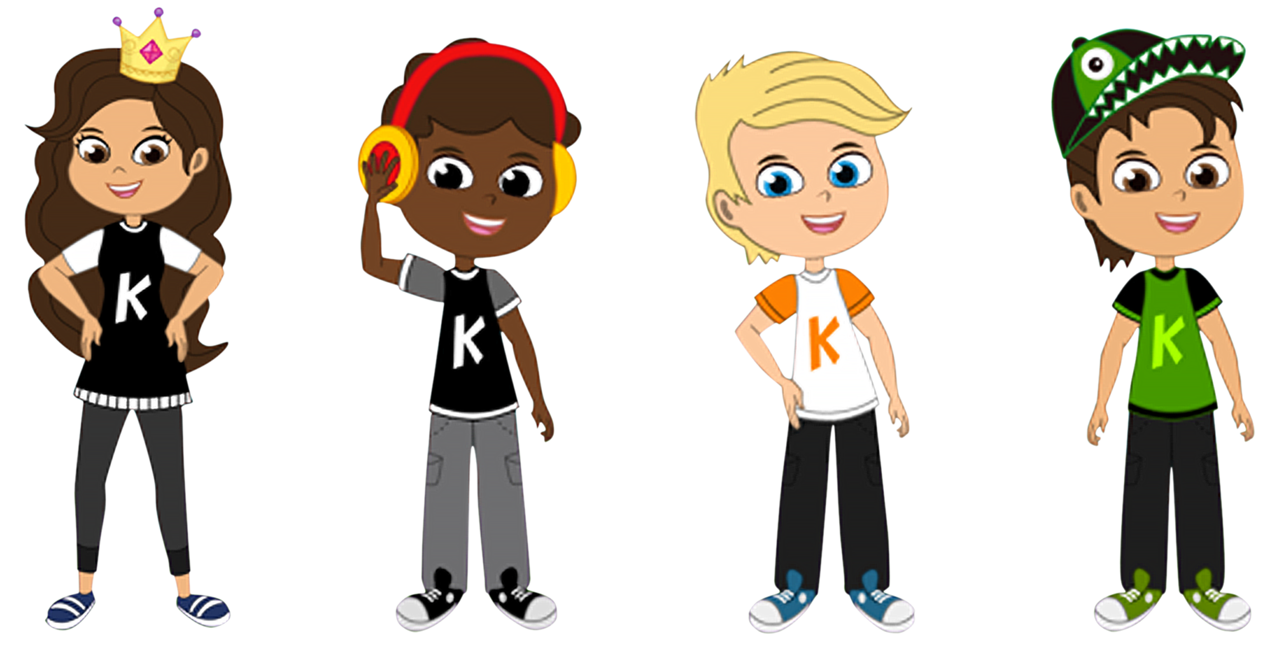
For our 'Live Client' project, we worked directly with Erika Brodnock and the creative team for the 'Karisma Kidz' app. The app is an educational learning tool, for children, focussing on emotional learning.

Project highlight - Running a Design Studio at the BBC Television Centre, London; including managing two remote developer teams from Poland, via Skype.
CASE STUDY
Discovery Phase
The 'Original brief' from our client was very broad, with many areas to look at, including new features and games for the app, on-boarding screens for both parent and child, the HUD, logos and fonts. From this our initial research was focused on apps for children aged 3-8, both direct and indirect.
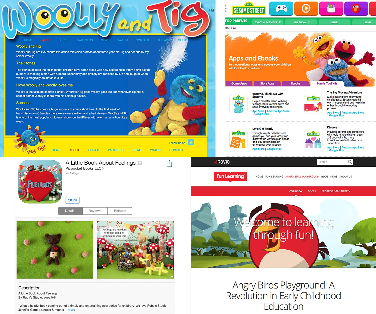
We found that there were many competitors on the market, especially from cBeebies and Sesame Street, with competition from Angry Birds Playground, Minecraft. Indirect competitors included TV, sports, after school activities, books and physical toys such as Lego.
Through a three-hour stakeholder meeting with our client, we learnt more about the App's history, its development, the core beliefs behind it, and the numerous ways we could help out. We were also given a full walk-through of the app and its features.
We learnt that the app would be launched in three weeks' and one of the many issues for the client was the need to re-vamp the website and bring it in line with major developments of the app. After further analysis of the meeting notes, we concluded that the best way we could help our client was to redesign the website entirely.
Problem Statement
Our client Karisma Kidz is launching their fully developed App on the Apple App store in two weeks time. At present the site does not reflect recent developments in the App or its content. The website is heavily weighted to the business, without championing the App itself, nor does the quality of the website design reflect the high quality that the App has been developed to.
Design Solution
Our aim is to design a new website that champions the fully developed App and its key features to parents who are seeking further information about the features and specifications of the App. The website will primarily promote the social learning and emotional growth features, from which children are encouraged to develop core skills, giving them the foundations for life. The website will be responsive, primarily designed for viewing on iPad’s, with information clearly presented and easy to digest.
With this in mind, we asked users to complete tasks with the current website, to see if they could navigate to key features and important information about the app, its core values and the people behind it.
Some of the positives we found were that the current website was very colourful and cheery, very visual, and has lots of positive messages. Some of the negatives were that the font is very hard to read and that the website does not reflect the app, nor does it promote it in any way; so much so that many people looking at the website thought they were primarily selling merchandise and did not even have an app.
From this exercise, we were able to group the features together, and have a good idea of what features should be prioritised before going into the client’s office, at the BBC Television Centre. While considering features that would be useful for the app, we were also able to better understand what was lacking in the current website, and what information would need to be improved upon within these features.
Competative Analysis
After realising that the brief was no linger about creating content for the app itself, we re-directed our research to that of the other websites that are the promotional sites for the apps themselves. These websites are tailored specifically for them, quite often apearing as micro-sites within a company's website, and in turn informed us of who the relavent competitors were.
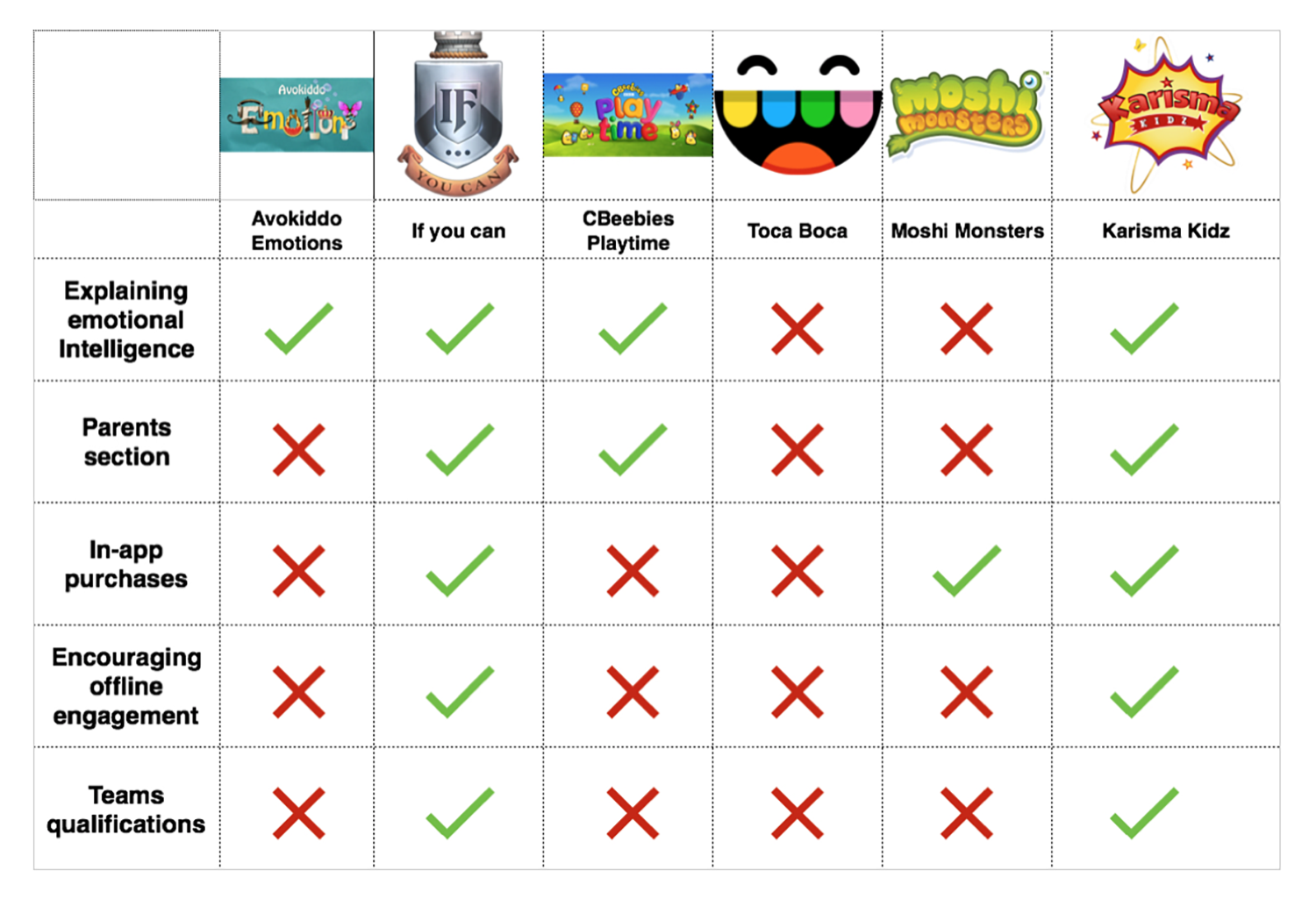
Within the market, many of the apps that were suggested to us in the client interview, such as Avokiddo, Toca Boca and Moshi Monsters, did not have many of the features that our client was championing and seeing as her unique selling points. Not many of the very successful games, charged in-app purchases, contrary to our client’s business model
We found that ‘If you can’ and Karisma Kidz were leading far ahead in areas that our client saw as a place to really grow, but through user testing, potential customers found this information incredibly hard to find or understand on the current site.
Survey
To answer some of the questions that we knew were essential to gain insights that might influence the design process and tell us of the users needs, we sent out a survey via Google surveys, which can be found here.
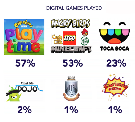
The survey gave us some very important information that our initial research did not inform us of. Even though ‘If you can’ and Karisma Kidz were both the market leaders in their fields of emotional intelligence and encouraging engagement off-line, neither of them had been played or even heard of by 99% of all those interviewed. This shows a vast area for improvement and growth market for Karisma Kidz, once the new website is more targeted.
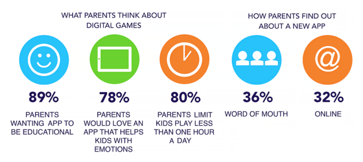
Through researching the market we learned from both the user interviews and questionnaire that parents are very interested in apps that are educational for their children, and apps such as the cBeebies app provide so much free content, that parents are more likely not to pay for any in-app purchases.
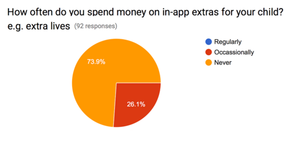
Through our user interviews we found that parents resoundingly thought that, although they would be willing to pay for content to be unlocked, such as levels, they would not pay for in-app credits to spend within the game, especially when used as a rewards system for children, finding that it went against their core beliefs in not rewarding children for doing everyday tasks.
Define Phase
Emotional Intelligence
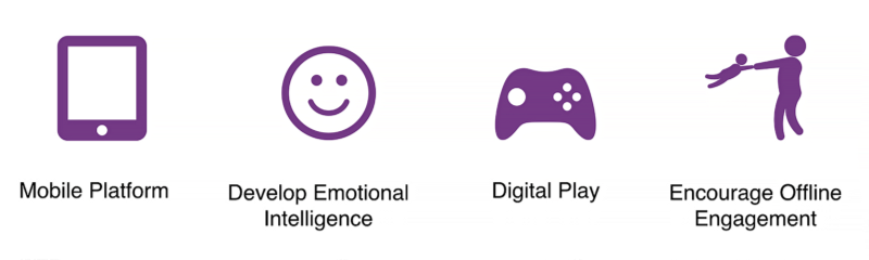
Through the client interview with Erika the most important aspects for her about the app, was its focus on ‘emotional intelligence’, and her three key values. For this reason we focussed on championing this within the website, as it was very hard to understand at present, and to explain what it was to the customer base.
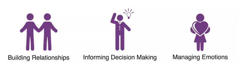
From our research we learnt that emotional intelligence is “the capacity to be aware of, control, and express one's emotions, and to handle interpersonal relationships judiciously and empathetically. Emotional intelligence is the key to both personal and professional success”.
Personas
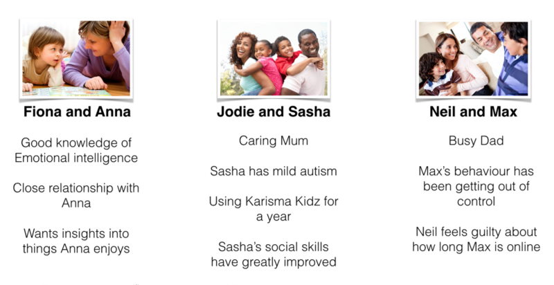
From the interviews and survey we were able to draw up three core personas that represented our user base. A persona is a representation of a group of users who follow shared common interests, traits, or demographics. By grouping together these people, an overview of all the users can be seen, and addressing the needs of each group can be more easily targeted.
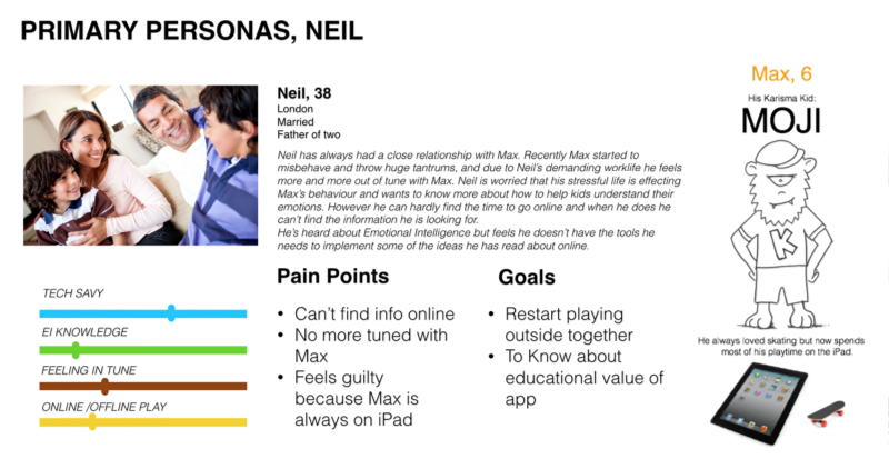
Of our three personas, Neil and his son Max were our parent and child persona, focussing on the core user groups for the app. This group comprises of parents who want their children's behaviour to improve through emotional learning within the app, and real-world shared tasks and activities with the family, outside of the app.
User Journey
To help us focus on the problem, we created a user story of a child who has turned into a monster. This journey follows our primary users Neil with his son Max who is having behavioural problems, for which we created a storyboard to better understand the problem at hand, and to work out the solution to it.
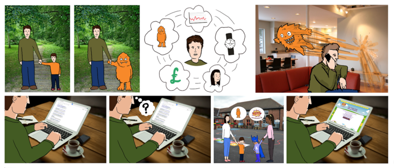
With Neil working long hours, Max goes off the rails, but Internet searches do not help. Through recommendations at the school gates, Neil researches the Karisma Kidz app, only to find that the website does not back up what his wife was told, as it does not reflect the style, content or messages of the app. At this point they are lost as potential buyers of the app.
With a re-design of the website to better reflect the app, we feel that the end of the user's journey would change from being a lost customer to a converter sale through call to action and completion.
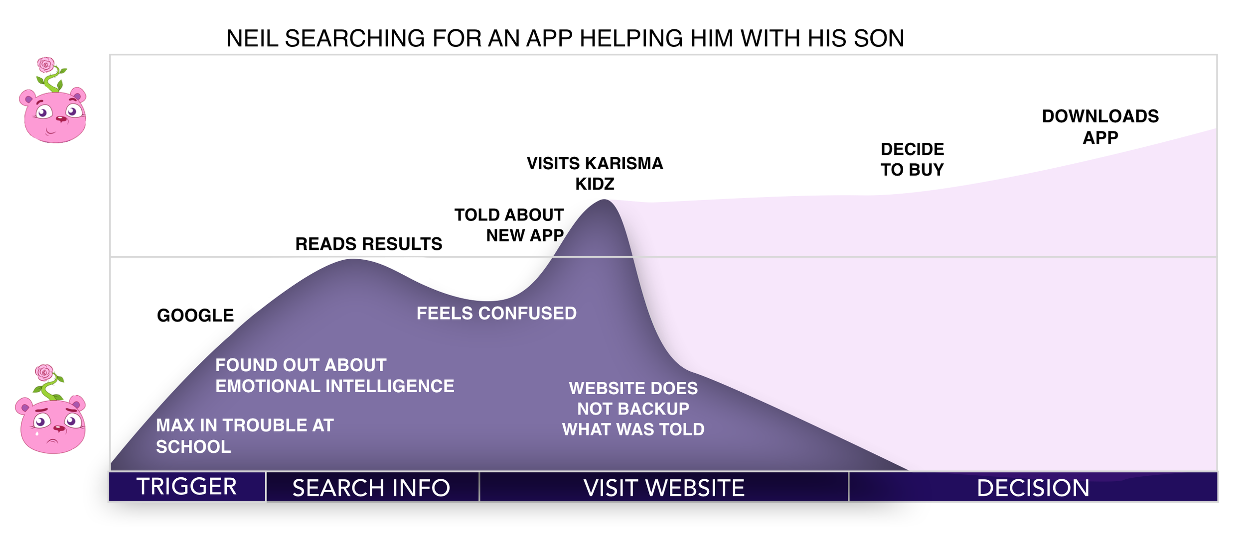
Key Insights
- Parents really care about the core messages behind the app, but that the message is currently lost on the website.
- Parents also trust in word of mouth recommendations.
- Parents want to be reassured that an app that claims to be educational and about emotions is backed up by qualified and respected industry professionals.
Design Phase

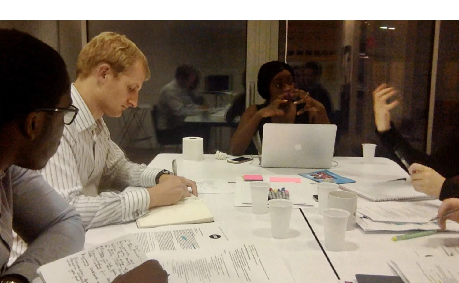
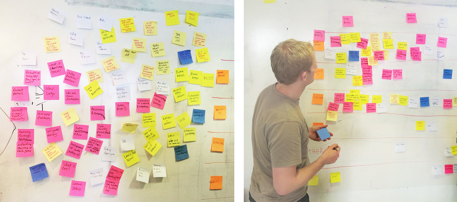
After wrapping up the research phase, we moved into the design phase. My highlight of the whole project was running the Design Studio at the BBC Television Centre in London, including managing two remote developer teams from Poland, as well as Erika and our own team from the studio office.
A Design Studio is a collaborative workshop to generate ideas, designs and sketches, with members from every step of the production process and to involve anyone with ‘ownership’ of any key element of this process.
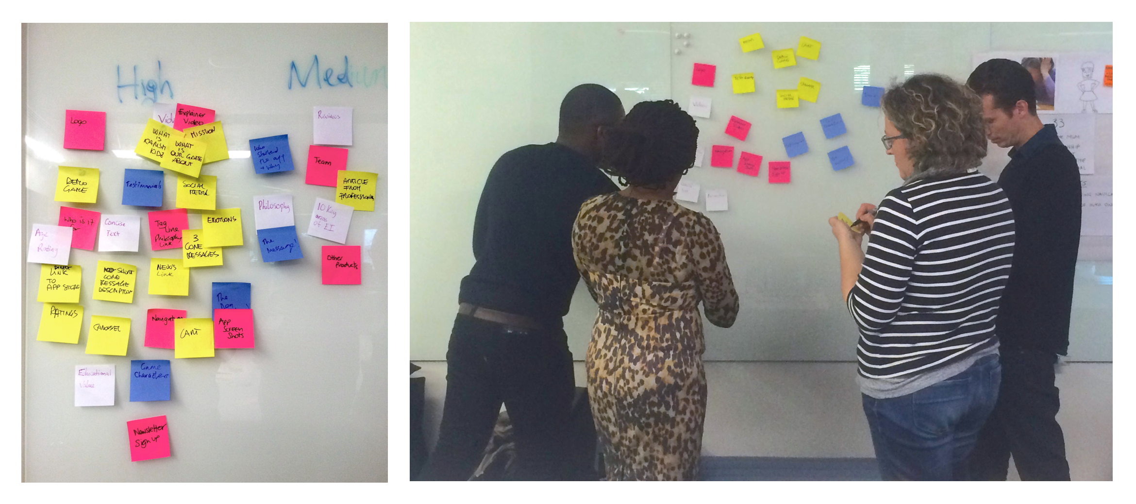
We started the Design Studio by looking at the content that could appear within the site, which would help us to define what we would focus on, and to generate as many ideas and sketches for the home page as possible.
Throughout the afternoon we ran two rounds of design, each with design, presentation and critique time boxed sessions.
Managing the teams from Poland was the biggest challenge with Skype connections and visibility issues, which were solved mostly by holding the laptop up so that the remote teams got to see what people were presenting within the BBC Television Centre office.
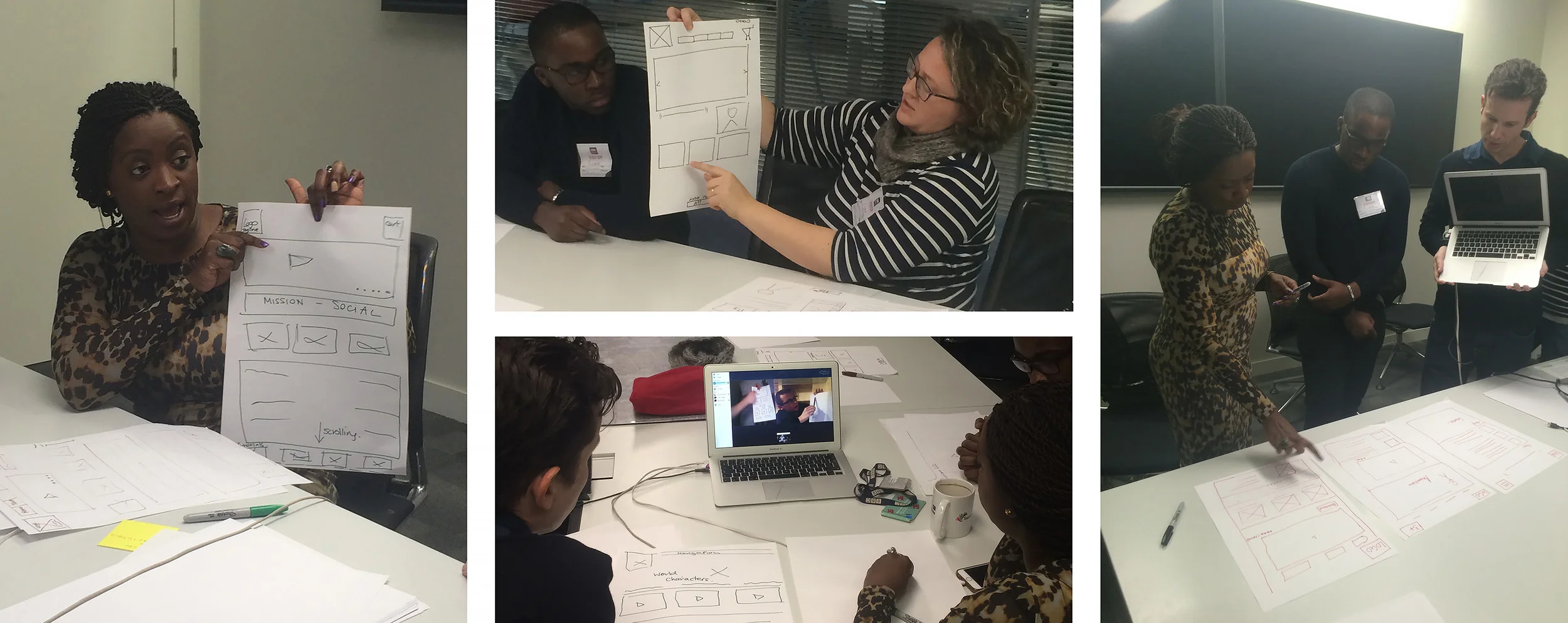
After completing the first Design Studio with our client and her team, we returned to our own office, and continued to run the Design Studio for the rest of the pages that we had highlighted as needing content for the creation of the website.
Mash Up
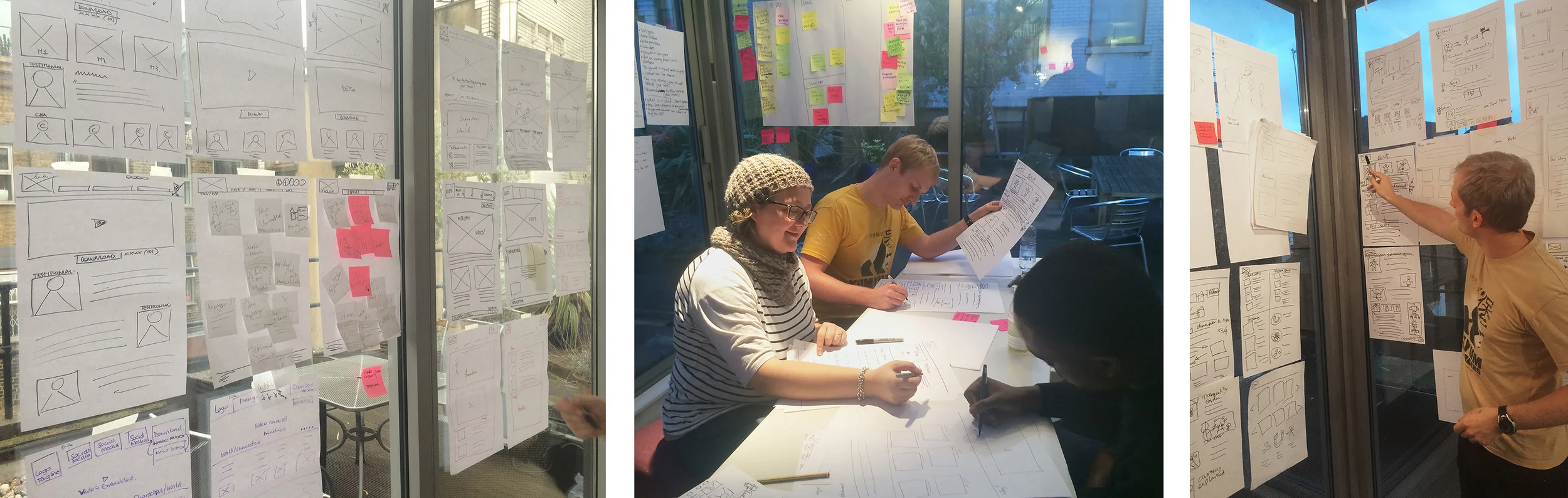
Before continuing with the other website pages, and after each session of each page, we did a ‘mash-up’, which is where all of your ideas have been presented and pinned up on the wall, and as a team, we worked out what the best elements of each design were to create one ‘master design’, from which we could then go and test with users.
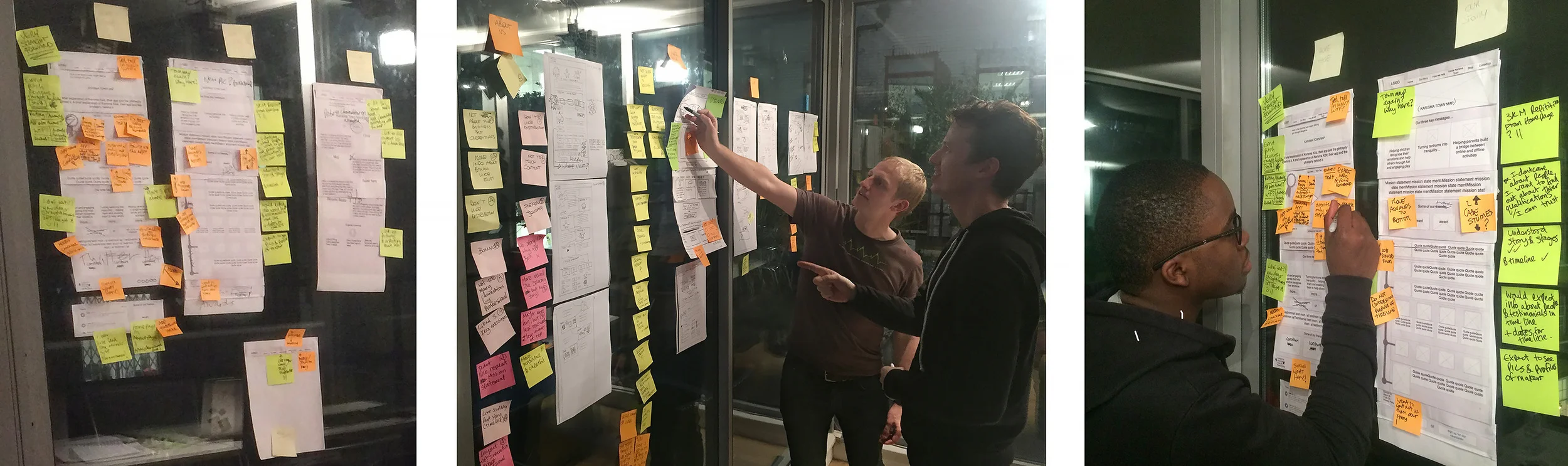
We quickly realised that there were two design routes available: one that was more formal, and one that was more in keeping with the designs and themes of the app’s content. For this reason we ran ‘A/B testing’ with users, which is where users are presented with two different designs of the same page and asked what they are learning from the pages and how they understand the content, layout and design of the pages.
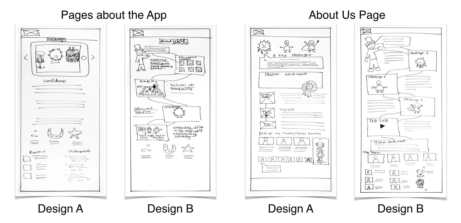
From the A/B testing we learnt that users found that the more formal designs for the main page and ‘about us’ pages were more appropriate, as those are the pages which they expected to be more authoritative, whereby they were expecting key information on the app and people behind it, such as child psychologists and educational experts
For the pages about the app itself, users found that the ‘path route’ was more appropriate as it was a better overview of the information. When the ‘parent/child’ or ‘town/app’ pages were shown as two pages instead of four, users found it was far too much information on one page, but when they were split, it was easier to navigate and much clearer information to digest.
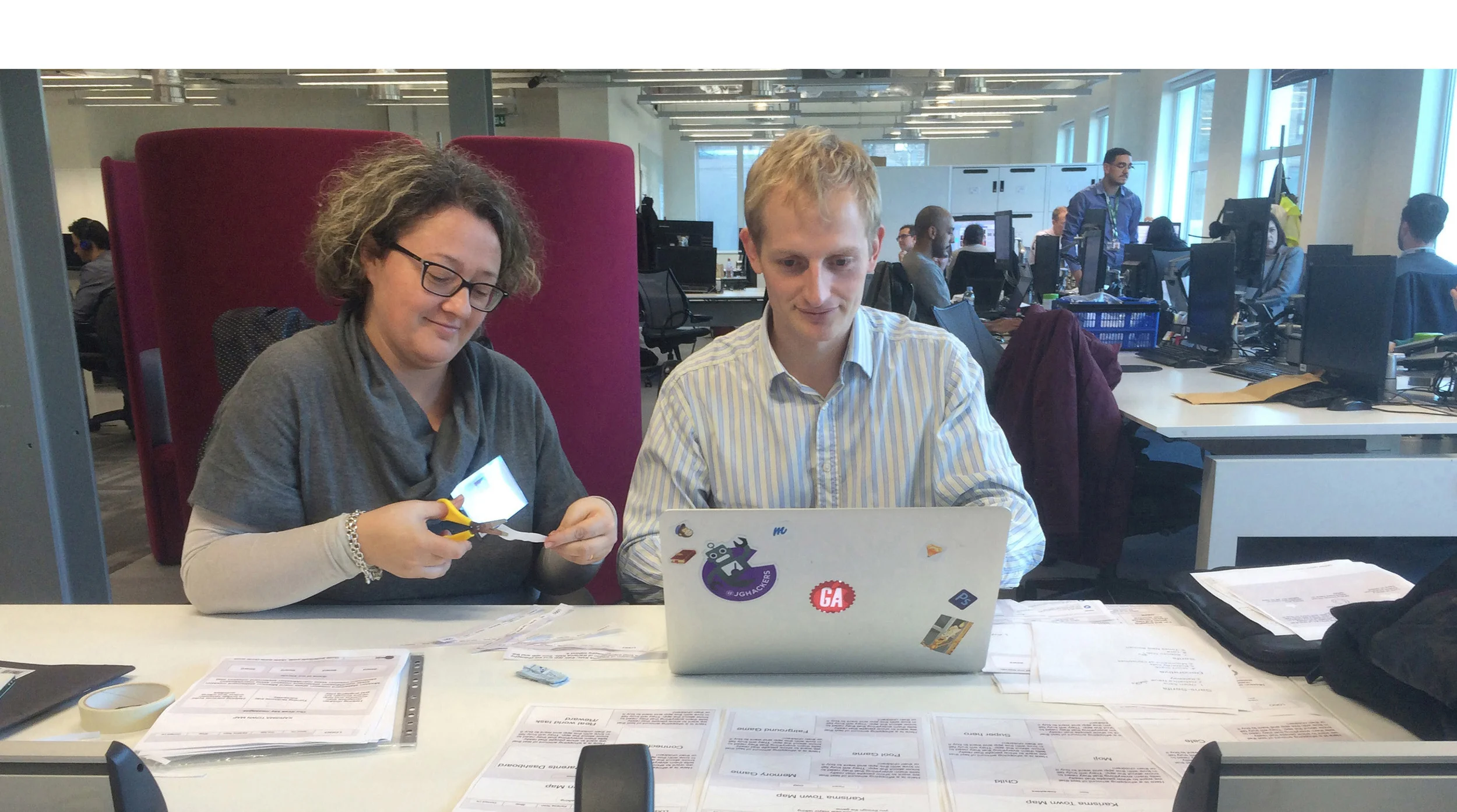
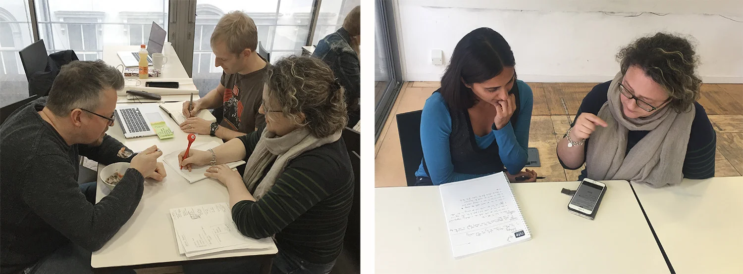
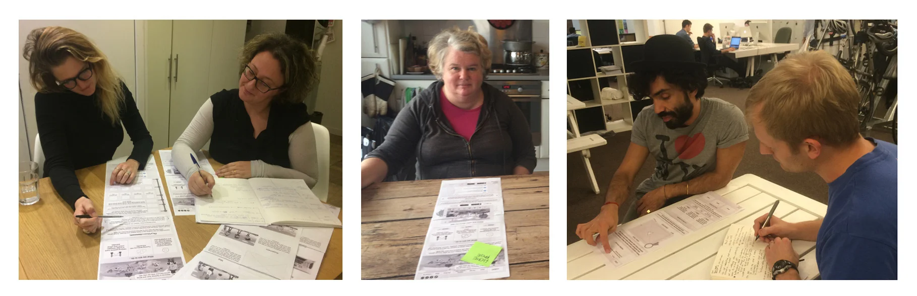
For the first round of digital wireframes, we tested at the BBC Television Centre, primarily with parents, but also with a range of users. This first round of wireframe testing was looking for feedback on layout and functionality only.
The next step for me was to populate the wireframes with images and basic placeholder information. These were then shown, once again, in black and white for feedback on layout, content, imagery, and functionality, with parents and current users of the Karisma Kidz app.
Visual Design
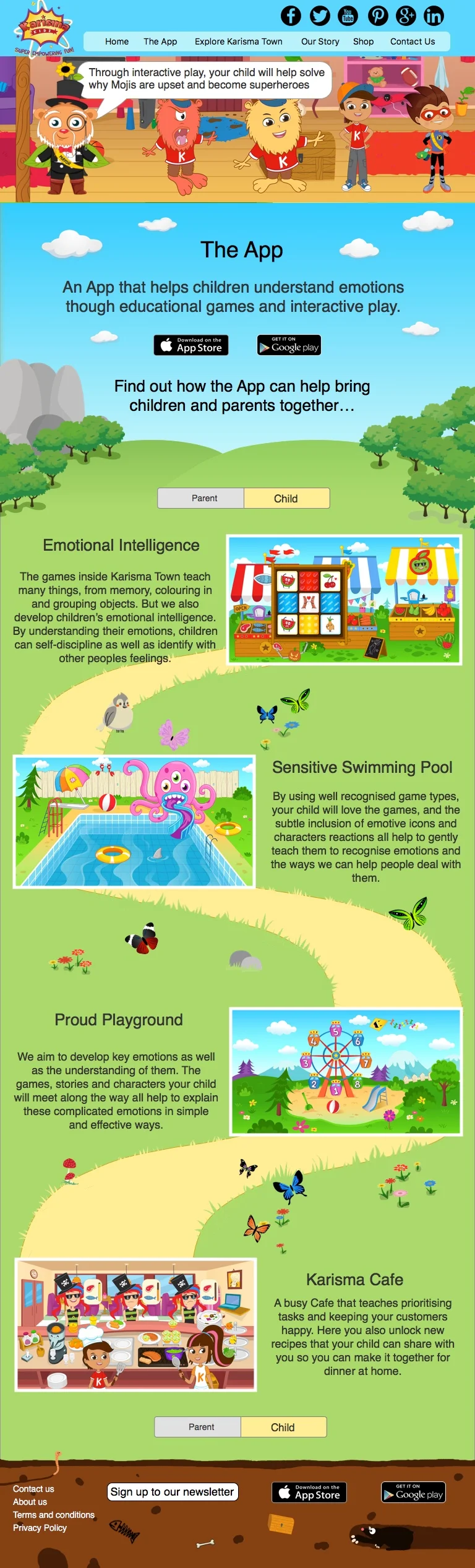
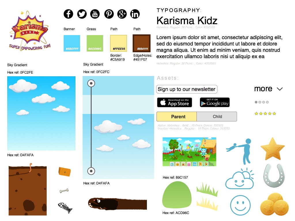
After completing multiple rounds of iterations and testing I was tasked with the challenge of creating the high fidelity wireframes, working with the client to create a 'Style Tile', and then populating the pages with assets from the original artwork.
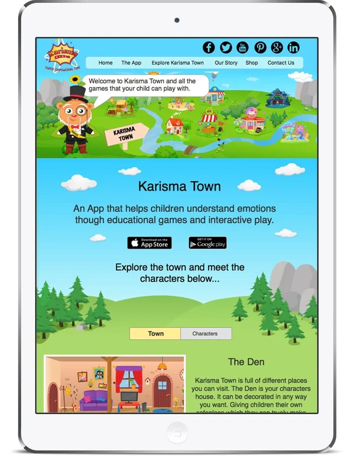
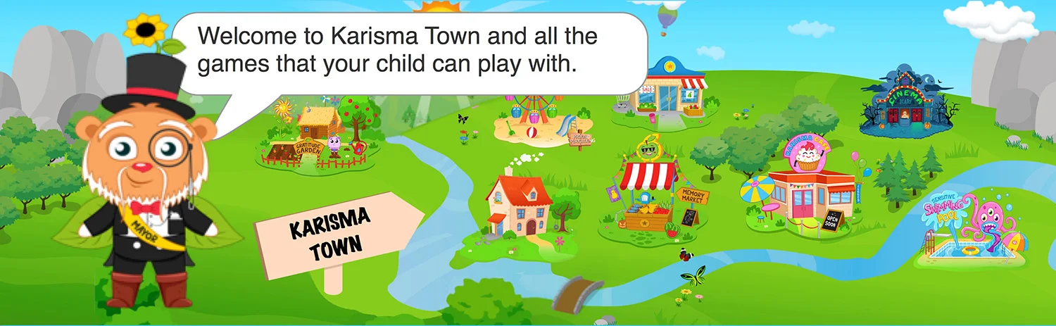
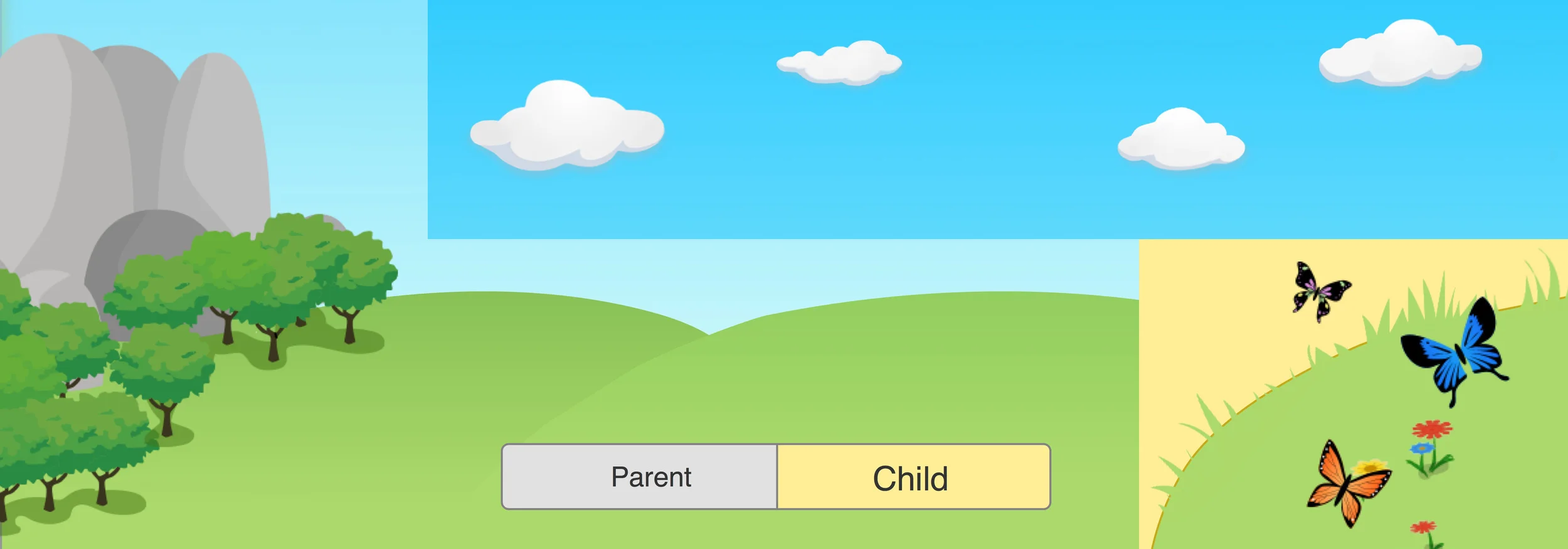
The original Karisma (town) map was provided as an Illustrator file, which I stripped down and created floating '.png' assets of each town element, right down to individual items such as tree and flowers. The map was reorganised to create space for the ‘Bloomer Mayor’ to narrate each header banner, with layouts realised in Sketch.
Every element within the pages was created from existing artwork from the Karisma Kidz app, except for the 'underground' assets and clouds, which were created from 'iStock Photo' as a ‘cleaner’ cloud.
Iterations
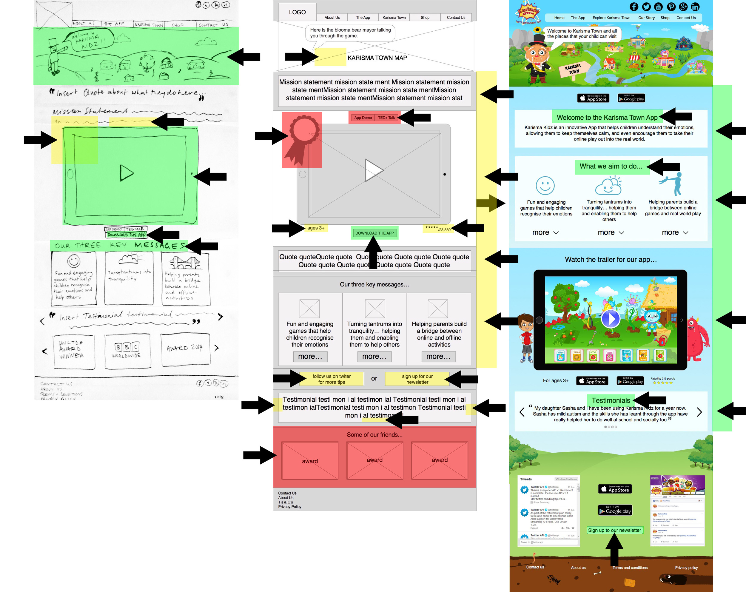
For the ‘Home Page’ the screen was moved down the page. Although users did want to watch it, they wanted to find out what the core principles of the app were first and a short introduction, with testimonials coming in further down, and being able to see more than one presented to them.
The newsletter was important to the client, and moved to being between the Twitter and Facebook feed, with the call to action appearing at the top of the page, below the demo screen, and at the base with the social media. This was heavily tested and modified to be more visible, based on user feedback and the importance of it at every key opportunity. Social media buttons were added at the top right.
For the ‘About Us’ page, once again the mission statement and core values were moved to the top of the page, with social media at the bottom, with a call to action to download the app. The icons for the three key values were heavily tested with the third one changing due to users not understanding the bridge symbol.
The timeline was clarified and dates added due to user feedback. Elements of the app such as the trees and clouds were added to tie in the style of the web design with the app itself, but a softer blue added on this page, than on the pages about the app itself.
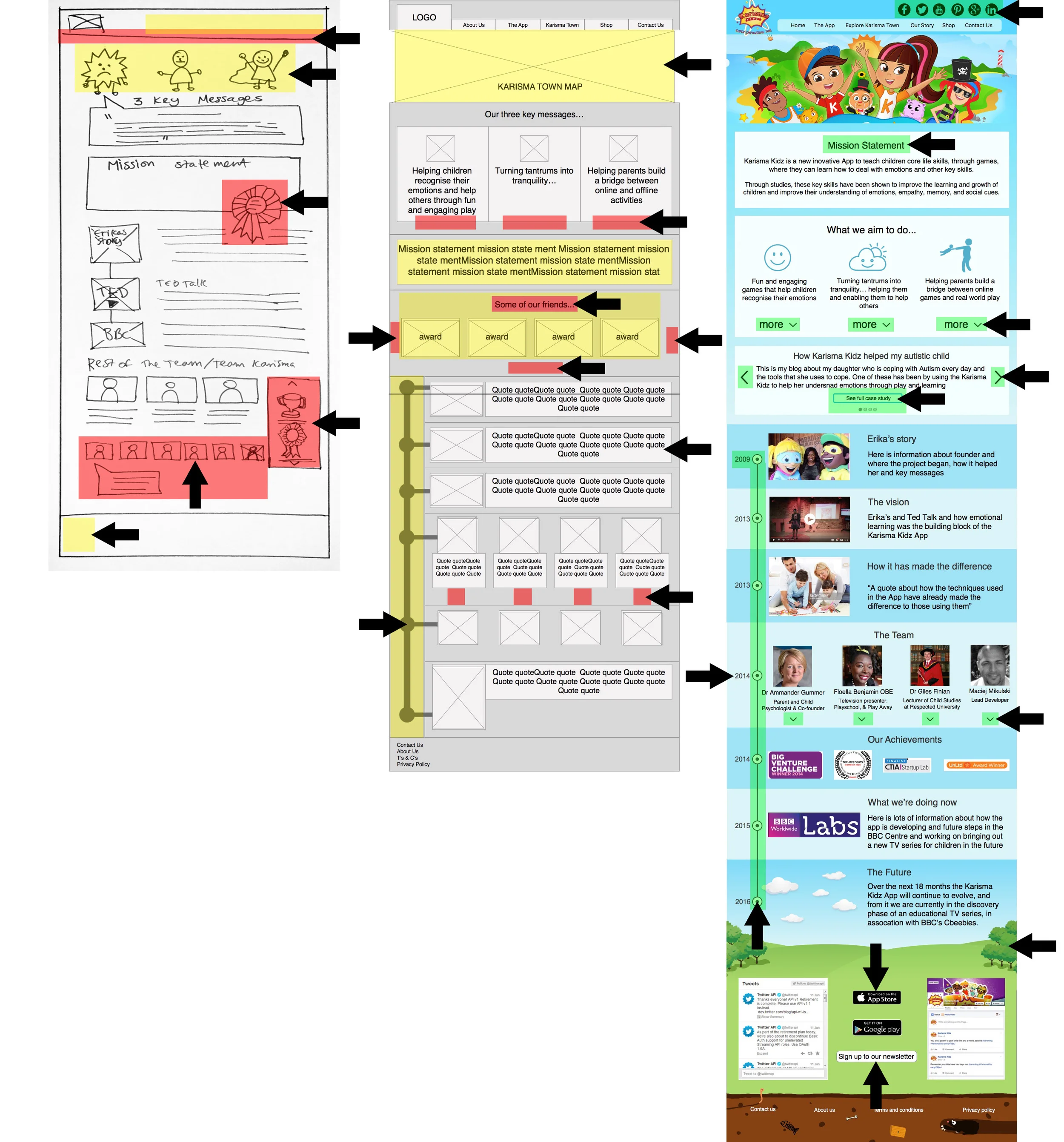
The apps awards were moved into the timeline, and members of the team, beyond the key four members, were hidden at first glance, due to users not wanting to see them and viewing too many as negative. We repeatedly found that users wanted to see experts in the field, as part of the team, such as a child psychologist, head teacher, or a lecturer of child studies.
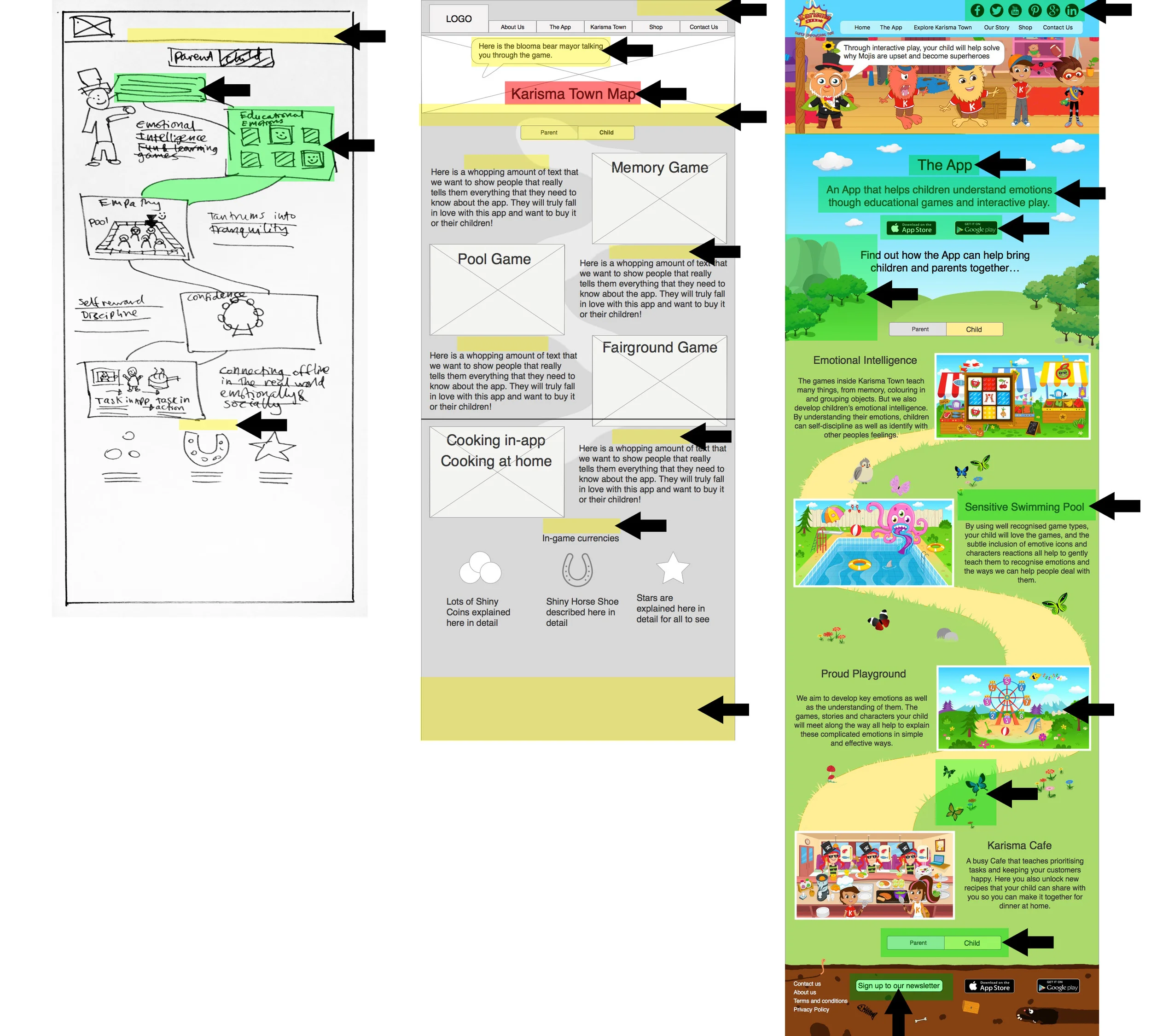
For the four pages about the app the key change was that on the ‘parent’/ ‘child’ or ‘character’/ ‘town’ pages, the buttons for changing pages should be at both the top of the page and also at the bottom, for clear navigation.
Early on user feedback asked us to show clear changes between both pages, so the path and position of the four information blocks flips position horizontally, whilst the graphics, taken from the app, shuffle around the page to create unique pages.
Through user feedback we also found that the images at the top of the page should change for each page, with only the home page and page about the town having the Karisma Kidz town map, with others targeted to the content of the pages.
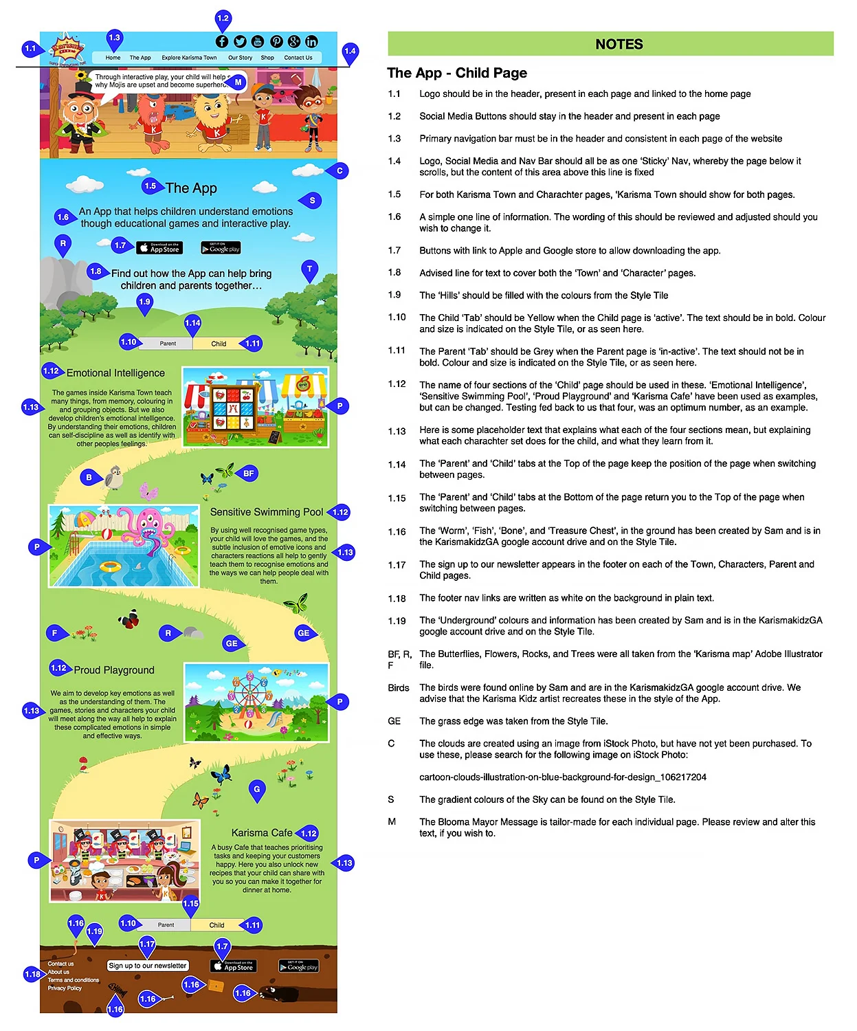
Annotated Wireframes
For the deliverable content for the client, one of the assets that was required was an annotated wireframe. Below is one of the annotated wireframes that I created, which contains all the instructions necessary for the web developers to take away and create the designed and tested pages.
Future Development
From user interviews and user testing, we found that the font would need to be extensively researched and tested, with a new font being used as the previous one was hard to read, and did not reflect the conversation aimed at the parents it was targeting.
We developed the site for parents to learn about how the game would help children, but a "Kids click here button' could lead to an alternative view focussed on children.
From user interviews and user testing, we found that the logo was too ‘manic’ and did not reflect the principles of the app’s core belief of getting children to understand and manage their emotions, through its teachings. A new logo was recommended.
Many people did not understand the original charms icons and we replaced it with a horseshoe, although a shamrock leaf could be used otherwise. Parents did not respond well to the paid charms system and further research was recommended to the client.
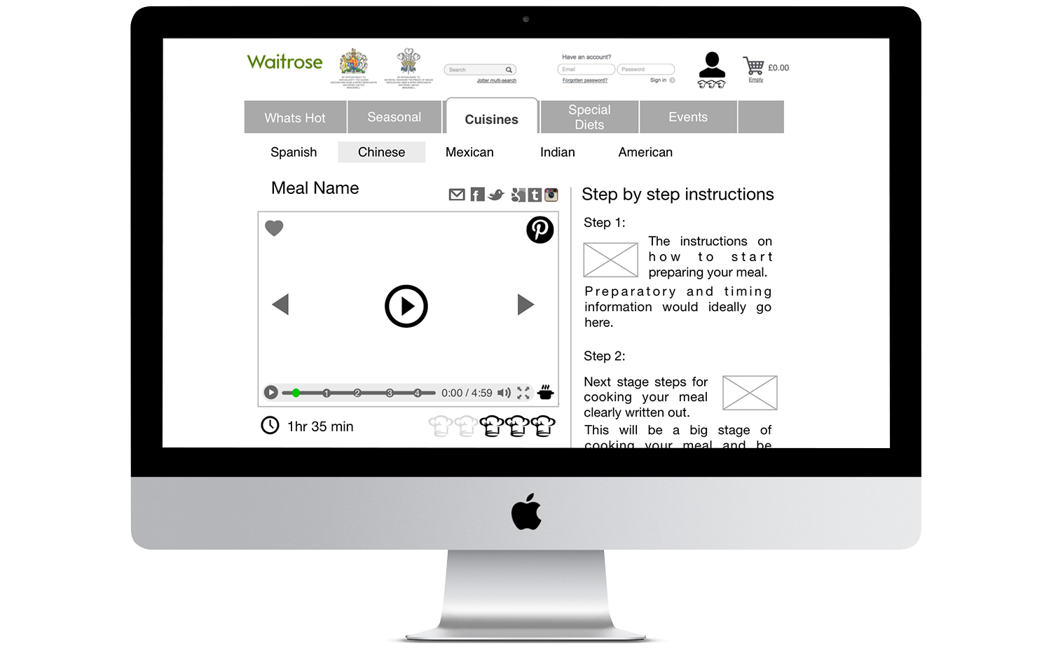
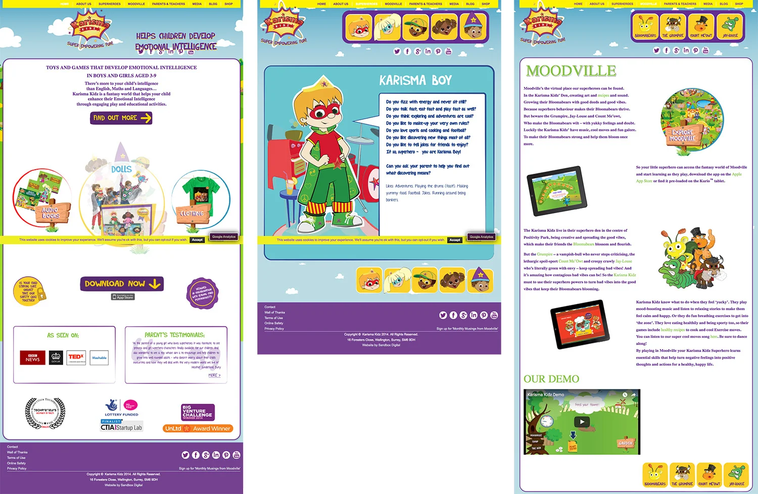
The Prototype
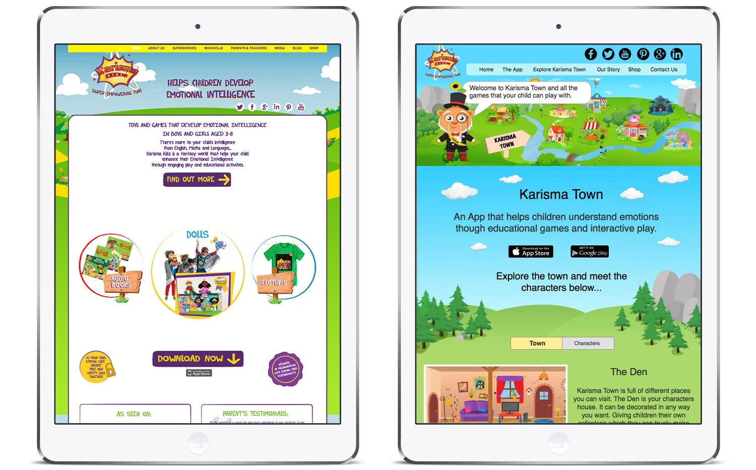
Site After
Site Before
In Closing...
From a 'Blue Skies' brief, we were able to entirely redesign the Karisma Kidz website to reflect the app, in just two-and-a-half weeks. Our client was so impressed by the new site design, she asked us for the assets to be delivered within a few days, so that her web designer could begin work re-creating what we had produced immediately.
With such a significant body of work created to such a polished standard, I am particularly proud of my roles throughout the project, including researching and interviewing, running the Design Studio, user testing, creating paper and digital prototypes, before creating the highly polished final product, from client assets. The whole process, design and functionality were led by the users, yet the look and feel of the site was directly influenced by the app itself.